|
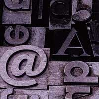
Choosing the right fonts is one of the most important decisions
you make in creating the right visual impact with your printed job.
First rule is always LESS is BEST!
Beware of using too many weird and wonderful fonts - the end result will be confusion. Also decide before you start whether you will use ...
 Fonts") - such as Garamond, Times etc
- such as Garamond, Times etc
best where you have lots of text, as it is more readable in bulk - or
 - such as Helvetica (Arial) or Gill Sans - such as Helvetica (Arial) or Gill Sans
where you want the printed page to look clean and modern
Fonts on PCs are different files than Apple Mac fonts though these days most are available for both platforms - or you can substitute a “look alike” often with a similar name.
Fonts can be either Postscript (sometimes called Type 1) or Truetype. Postscript are best but Truetype may be the only choice you have. Pagefast can use either for the output of film
While we have a large and comprehensive font library - be sure to supply YOUR fonts with the job for consistent results and to avoid possible output problems.
All fonts that you have used should be temporarily loaned to us for output of your
job otherwise we will have to substitute our own versions.
This is imperative for fonts embedded in eps files - as sometimes these can be difficult to identify if you have not created the original eps.
 Most applications have an option to “Save for remote print” or similar option. Most applications have an option to “Save for remote print” or similar option.
|